
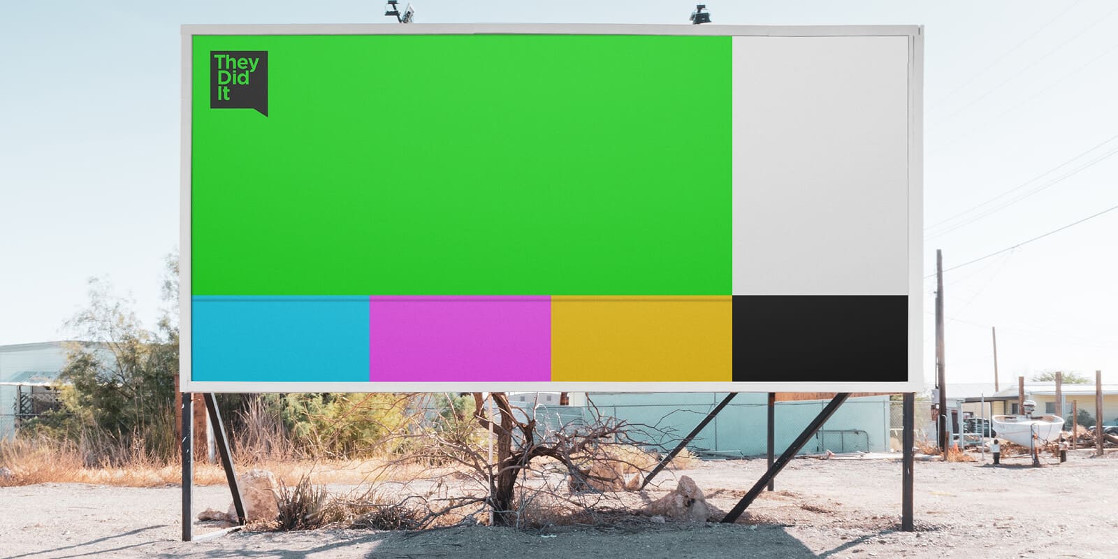
Colouring in your brand
Colour isn’t just decoration — it’s communication. The colours you choose for your brand instantly influence how people feel about your business. It’s not random; it’s psychology.
Colour choices should match both your brand personality and your target audience. A tech company may opt for cool tones (blues, greys) to signal innovation and trust. A kid-focused brand might lean into bright, playful colours to spark excitement and friendliness.
Know your audience’s emotions and expectations Limit your core palette to 2–3 colours for clarity. Test combinations for contrast and readability (especially for accessibility).
When you use colour intentionally, your brand becomes more memorable, trustworthy, and appealing. Great colour choices make your audience feel something — and in branding, how people feel is often more powerful than what they think.
So, don’t just choose what looks “nice.” Choose what works. Because the right palette doesn’t just make your brand beautiful — it makes it meaningful.
Bottom line? Don’t pick colours just because they look nice. Pick them because they say something. When done right, your brand colours will speak before your logo ever does.